The use of colour in your brand is a big decision, what to remember when designing a logo:
The use of colour in your brand creates a great deal of thought and discussion.
Recommendations range from:
- Use colours near to each other on the colour wheel (e.g. for a “warm” palette, use red, orange, and yellow hues).
- Don’t use colours that are so bright that they are hard on the eyes.
As well as a good use of colour in your brand, the logo must also look good in black and white, grayscale, and two colours so that wherever the logo is to be used in mono print, web, colour print or mobile it is always recognisable to your clients
Breaking the rules sometimes is okay; just make sure you have a good reason to!
K.I.S.S. (Keep it Simple, Stupid)
The simpler the logo, the more recognisable it will be.
Scalability:
A logo is not effective if it loses too much definition when scaled down for letterheads, envelopes, and small promotional items. The logo also has to look good when used for larger formats, such as posters, billboards, and electronic formats such as TV and the Web.
12 essential rules to follow in logo design
Even if you are on an absolute budget you should still print a brand/logo/message in mono for additional impact on your marketing print.
Using the colour in your brand for maximum marketing impact
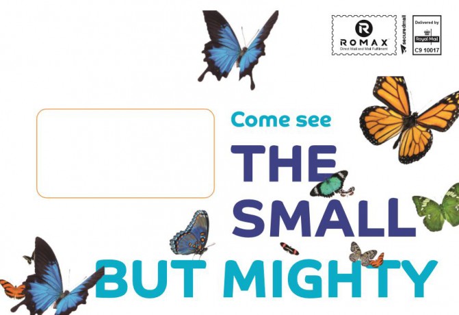
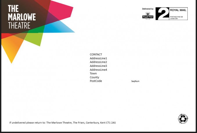
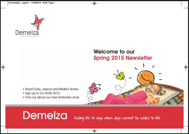
Colour printed envelopes are 9 times more likely to be opened than envelopes that are not. If your direct mail outer packaging contains No message, No brand and No colour this equals a missed opportunity.

How does your brand compare on the Colour Emotion Guide
Our Managing Director’s favourite colour is yellow according to the colour emotion guide (and him!) this reflects Optimism, Clarity and Warmth, so should we have a yellow logo? On the same guide, Blue denotes Solid and Dependable, demonstrating ‘Strength of Character’, so the brand would reflect that too? We should therefore have a happy (yellow) and a dependable (blue) logo. But what if our clients hate yellow and despise blue? What to do?
The key here is that your brand is something that becomes known over time and as long as the logo is easily recognisable and that the message and ethics that the business promotes are reflected in the brand by regularly promoting them and positioning the brand at every opportunity, and every marketing message, this will become engrained in the positive psyche of your clients and potential market.
Our clients that make great use of this to improve their marketing message:
Vulcan – Charity
So much time is spent designing your logo to reflect your brand, it would be foolish to not include it at every opportunity, to reinforce your organisation’s marketing message, so get your brand recognised. Or you can raise the design contest and choose a logo that suits the best for your business description.
Contact Us
« Client Services in Print and Direct Mail Data Can Make or Break Your Marketing Campaign »


